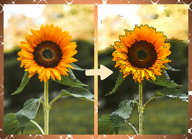

A good image can change the way people experience a story. Whether it is a photograph from a weekend away, a product shot for a small business, or a graphic prepared for social media, the right image format can make a noticeable difference to how that visual looks, loads, and works across different platforms.
Most people rarely think about file formats until something goes wrong. A picture looks fine on a phone but becomes difficult to use on a website. A graphic needs a transparent background, yet the file does not support it. Or an image that should be crisp and professional appears slightly blurred after being uploaded. These small frustrations are common, but they are also surprisingly easy to avoid. For anyone who regularly works with digital content, a JPG to PNG converter can be a practical part of the workflow when a different format is better suited to the job.
Why Image Formats Matter More Than You Might Think
JPG and PNG are two of the most familiar image formats, but they are designed with different priorities in mind.
JPG is particularly useful for photographs. It uses compression to reduce file size, making it convenient for storing large collections of images and sharing them online. That is one reason it has remained a standard format for digital photography for decades.
PNG, on the other hand, is often a better fit for graphics, illustrations, logos, screenshots, icons, and images where clarity matters. One of its most useful characteristics is support for transparency. That means a graphic can sit naturally over a coloured background without appearing inside an unwanted white or solid-coloured box.
Understanding that distinction can save time. Instead of treating image formats as interchangeable, think about what the image needs to accomplish.
When PNG Makes More Sense
Imagine you have created a simple logo for a new café. The logo needs to appear on a website, printed promotional material, social media graphics, and perhaps a presentation. If the logo has a white background baked into the image, placing it over a dark webpage or coloured poster can look awkward.
A PNG version with transparency can solve that problem.
The same applies to social media graphics. A designer might create a decorative illustration that needs to sit on top of photographs or coloured backgrounds. A transparent PNG allows the illustration to blend into the design instead of forcing the designer to work around a rectangular background.
PNG can also be useful for screenshots. Text, interface elements, diagrams, and sharp lines generally benefit from a format designed to preserve crisp visual detail.
A Practical Example: Preparing Images for a Website
Consider a small independent magazine publishing an article about a local artist. The accompanying photograph might be perfectly suited to JPG because it contains a lot of colour and subtle variations in tone.
The artist’s logo, however, is a different story.
If the logo needs to appear in the article header, on promotional graphics, or alongside other visual elements, PNG may be more appropriate. The logo can retain sharp edges and, where required, a transparent background.
The important lesson is not that PNG is universally better than JPG. It isn’t. The better choice depends on the image and how it will be used.
Keep File Size in Mind
There is a temptation to assume that converting an image into another format automatically improves its quality. It does not.
PNG files can be considerably larger than JPG files, particularly when they contain detailed photographic imagery. For a website, unnecessarily large files can contribute to slower page loading, which can affect the browsing experience.
Before uploading an image, ask yourself three questions:
- Is this primarily a photograph or a graphic?
- Do I need transparency?
- Does the image contain fine text, sharp lines, or simple shapes?
For photographs intended for quick web delivery, JPG will often remain the sensible option. For logos, illustrations, screenshots, and transparent graphics, PNG may be more practical.
Quality Is About More Than Resolution
People often focus on resolution when discussing image quality, but file format also plays a role.
A high-resolution image can still look poor if it has been heavily compressed. Likewise, an appropriately sized image saved in a format suited to its purpose can look excellent without creating an unnecessarily large file.
For professional-looking digital content, it is worth starting with the highest-quality original available. Make edits from that original rather than repeatedly opening, modifying, and saving the same compressed file. Every unnecessary generation of editing can introduce additional degradation with formats that use lossy compression.
A simple folder system can help, too. Keep original photographs separate from edited versions and final exports. This gives you a clean source file if you later need a different size or format.
Think About Where the Image Is Going
The destination should influence your decision.
A website may require lightweight images for performance. A presentation might need crisp graphics that remain clear on a large screen. Social media platforms may apply their own compression after uploading. A printed publication has different requirements again.
Before exporting anything, check the platform’s recommended dimensions and file types. There is little benefit in preparing a huge image when the final display size is small.
For businesses and content creators, consistency matters as well. Using appropriately formatted images across a website, newsletter, social channels, and marketing materials can make a brand feel considerably more polished.
A Few Habits That Make Image Management Easier
Good image management does not need to be complicated. A few straightforward habits can make a significant difference.
Keep the original. Always retain an untouched copy of important photographs and graphics.
Choose the format based on purpose. Do not automatically use one format for everything.
Check transparency requirements. If an image needs to sit naturally over another background, transparency may be essential.
Avoid unnecessary conversions. Converting files simply because you can may increase file size without providing a meaningful benefit.
Preview before publishing. Look at the final image at the size and location where people will actually see it.
Rename files sensibly. Descriptive names such as summer-jazz-festival-poster.png are far more useful than strings of camera-generated numbers, especially when working on larger projects.
Better Images, Better Digital Experiences
Images are often treated as decoration, but they can influence how people understand and remember digital content. A well-prepared photograph can draw readers into an article, while a clean graphic can communicate information almost instantly.
Choosing the right format is a small part of that process, but it is one that can have practical consequences. Once you understand what JPG and PNG are each designed to do, decisions that initially seem technical become much more straightforward.
The goal is not to chase the newest format or convert every image you own. It is simply to match the file to the job. With that approach, your images can remain sharp, practical, appropriately sized, and ready for wherever your next story, project, or creative idea takes them.